The Shift logo style’s roots lie in print rather than web design and they appear as transparent overlays of color. The shift look appears as letters or objects in RGB or CMYK, appearing as though they are misregistered or printed incorrectly. These logos tend to have limited colors and a very clean look despite the overlapping layers. In the case using pastel colors, the logos look gentle and peaceful, while the logos using reds and dark pinks have a 3D quality about them. That is 3D without wearing 3D glasses.
While the images in logos are obviously static, the shift look gives them a sense of movement or motion which is eye-catching. On first glance these identities look like several elements blending into one, or conversely, one element breaking into several pieces.
So for your design inspiration and visual enjoyment, let’s have a look at a few examples to see what makes these logos unique yet fit into a category.
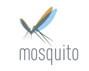
Mosquito by Jarsson
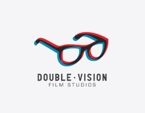
Double Vision by Jgarnerdesign
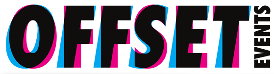
Offset Design and Illustration Conference
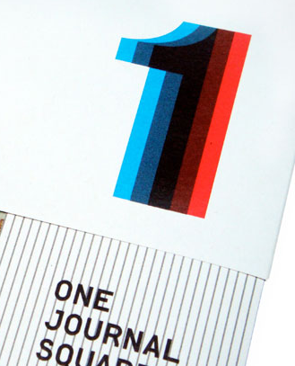
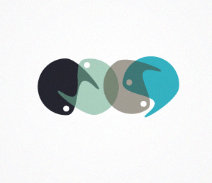
One Journal Square by Emily Schwartzman
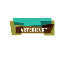
Arterieur and Shapes by Anna Kovecses
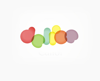
Delice by Alex Tass
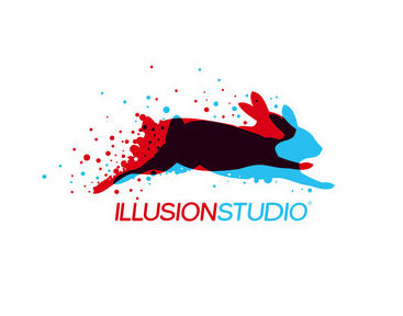
Illusion Studio by Adrian Knopik
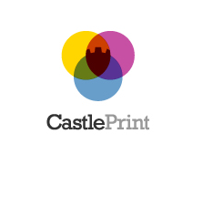
Castle Print by Sean O’Grady
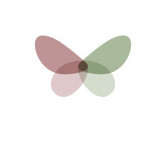
Escape by Bojan Stefanovic
What do you think of these logo designs? Have you seen other logos that you like featuring the “shift” look?
Related posts:
- Creating Typographic Logos
- Logo Design 101: Six Tips For Creating Iconic Logos
- Looking at Logos: Pixel Logos
- An Insider’s Guide to Type and Symbol Logos
- Logo Design Trends: The Rainbow
Jennifer Farley
Jennifer Farley is a designer, illustrator and design instructor based in Ireland. She writes about design and illustration on her blog at Laughing Lion Design.
