I would like to create (at least) two pivot charts sourced from the same data that display the data in different groupings; one will be grouped by years, the other grouped by months. I am able to create the two charts each on their own, but as soon as I create them both on the same Sheet/Workbook, they become linked and changing one changes the other.
The data for these charts is updated weekly so I don’t want to create entirely separate workbooks for each set of data I’m hoping to display in more than one way.
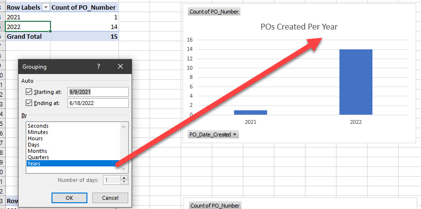
Is there anyway to ‘unlink’ the charts from themselves while still keeping them sourced from the same data? Something to do with data models? (I know the word but have never used anything in there.)
Example data:
| PO_Number | PO_Date_Created |
|---|---|
| 144867 | 6/2/2022 |
| 134028 | 4/18/2022 |
| 145140 | 6/8/2022 |
| 141421 | 5/23/2022 |
| 145623 | 6/17/2022 |
| 94305 | 9/9/2021 |
| 142399 | 5/24/2022 |
| 145629 | 6/17/2022 |
| 132022 | 4/8/2022 |
| 144968 | 6/6/2022 |
| 145587 | 6/17/2022 |
| 145617 | 6/17/2022 |
| 145631 | 6/17/2022 |
| 145299 | 6/13/2022 |
| 135080 | 4/29/2022 |
Here is the set up. I’d like one for Months and one for Years; however, since I set the Month one up after configuring Years, it overrode the first chart.
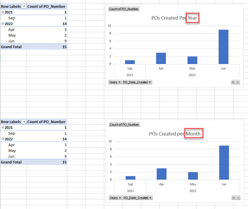
Each graph works, just not at the same time.
Any tips or things to try would be very appreciated!
