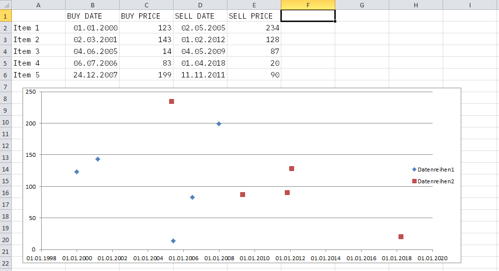
Objective: creating a visualisation of a number of cases, each consisting of two points (x|y), and illustrating the difference between these two using a line
Example: a table that records the dates and the prices at which a number of items were bought and sold
Consider the following data and the way they are visualised. We have five cases consisting of items that each were bought and sold at specific dates and specific prices.
The visualisation that I have in mind shows these five pairs of transactions with a “date” axis (x) and a “price” axis (y), and, most importantly, to illustrate the development of the prices, a line that, for each item, connects the “buy” and the “sell” dots.
90% of what I’m after is pretty straightforward:
Without much ado, I’ve managed to make Excel plot the “buys” (blue) and the “sells” (red). What’s missing though is their connection. Here’s a manual draft of what it should look like:
What are the necessary steps to achieve this? I suppose the problem in my current arrangement is that the main distinction is not between the five cases, but between the “buy” and the “sell” category (hence the misleading colours) — but I’m clueless as to how to make the necessary change.


