
This sponsored article was created by our content partner, BAW Media. Thank you for supporting the partners who make SitePoint possible.
The start of a new year is always an exciting time. Everyone makes pledges to be better, to feel better, to do better. But like many New Years’ resolutions that quickly get tossed aside or forgotten, fad-like web design trends have a tendency to follow a similar path.
That’s because it’s easy to get wrapped up in what’s cool now instead of focusing on what we can do to make a website grow stronger with each passing day.
5 Web Design Trends That Have Real Staying Power
Have a look at BeTheme and its 500+ pre-built websites. These clean and classic designs have real staying power.
That’s because they’re centered around strong design principles. Not flashy color palettes, hip font choices, or technology your users aren’t ready for or don’t need. And that’s the key, right?
You’re building websites for the end user — not for yourself.
Spending your time using web design trends that will come and go is making barely any impact on your visitors. You can take advantage of these tried, tested, and long-lasting web design trends …
Trend #1: Remove the Excess and Create a Super Minimal Navigation
One of the awesome advantages of the Web moving towards a more mobile-first experience is that websites viewed on desktop have become simpler and easier to navigate, too.
With more consumers flocking to the Web on their smartphones, website menus have had to shrink in size. Not only in terms of the space they comprise, but also in the number of links.
In 2020 and onwards, websites will have only the most essential of pages in the primary menu. Secondary links will be relegated to areas like the footer and sidebar. Consequently, this will help to clean up on-page designs. They won’t be so littered with call-to-action buttons pointing to internal pages.
The BeRepair pre-built site is a beautiful example of this. With its navigation tucked away under a hamburger menu icon:

When opened, the pop-out menu follows the trend of less-is-more. It has a short and simple-to-navigate list of links surrounded by a bunch of white space:

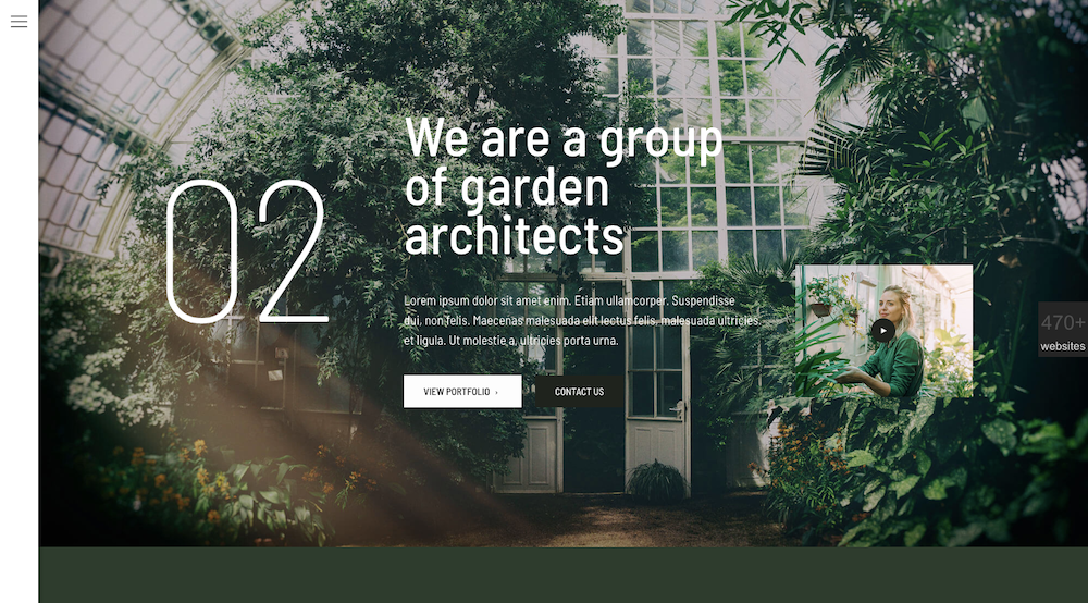
Non-traditional navigations can also benefit from this form of minimalism. BeGarden demonstrates this with its left-aligned menu:
Trend #2: Bring Greater Focus to Your Message with White Space
Users are overloaded with content, offers, and other distractions every time they hit the Internet. Do you really want your website to be one more thing that causes them stress and, in turn, indecisiveness?
When you design with white space, it gets you out of the habit of trying to put as much information and as many options into a single section or page as possible. Instead, it encourages you to do more with less.
Concise messaging + Wide, open spaces = Good for your conversion rate.
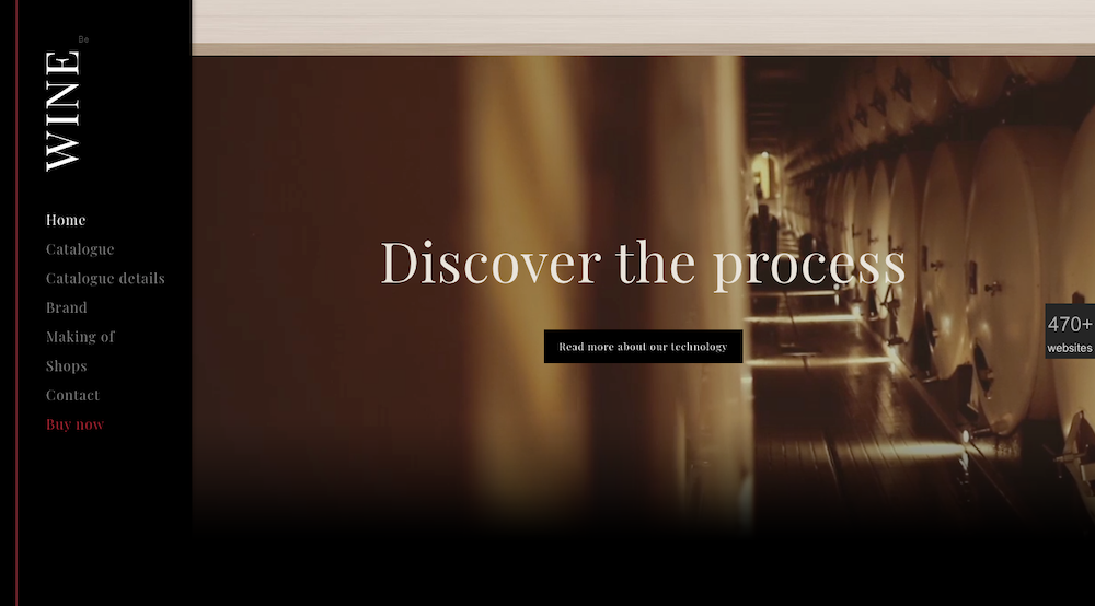
Take, for instance, this brief but powerful video banner at the bottom of BeWine:
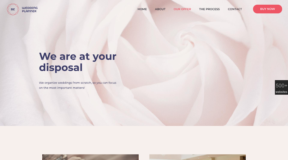
You can find other ways to let strong yet simple imagery tell your brand’s story, as the BeWeddingPlanner site does:
The post 5 Web Design Trends for 2020 with Real Staying Power appeared first on SitePoint.
