Favicons on the web have given us a taste of what some well known images and symbols can look like when reduced down to tiny squares. Pixels (short for picture elements) are the smallest part of a digital image. A pixel is essentially a small square of color located at a specific part of an image. As an essential building block of a digital image, it is probably no surprise that designers are using what looks like giant pixels as building blocks in their logo designs.
By their nature, the symbols created using pixels tend to look quite basic and often quite abstract. The symbols are colorful, but often with a range of tints based around one single color. They convey the idea of elements coming together to create a recognizable icon. Pixel-style designs require skill to pull off effectively, or they can appear to give the impression of a badly drawn (on the computer) image.
So now for your viewing pleasure and inspiration, here’s a small collection of logos using pixels as a major design element. (It’s probably no coincidence that a few of these businesses have Pixel or Pix in their names.)

Scans by HelloUriah
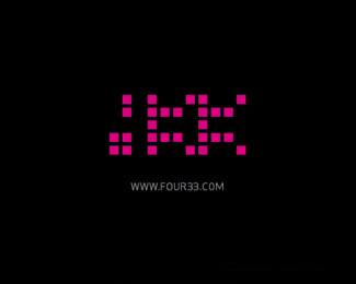
433 by Mister Jones

PyxPox by Bit Hoang

Digitweet by John Boerckel

Interoute by Jesse Higgins
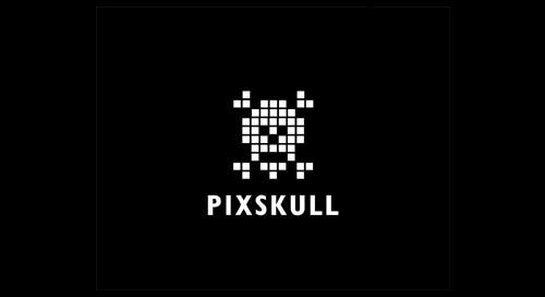
Pixskull by Mike Erickson
![]()
Pixlance by Mike Cresk
What do you think of these logo designs? Do you like the “pixel” concept? Have you used it in your work?
Related posts:
- An Insider’s Guide to Type and Symbol Logos
- Creating Typographic Logos
- Logo Design Trends: The Rainbow
- Logo Design 101: Six Tips For Creating Iconic Logos
- The Power Of Negative Space In Logo Design
Jennifer Farley
Jennifer Farley is a designer, illustrator and design instructor based in Ireland. She writes about design and illustration on her blog at Laughing Lion Design.
