Magento 2.4.2-p1
Smartwave Porto
all extensions from Amasty
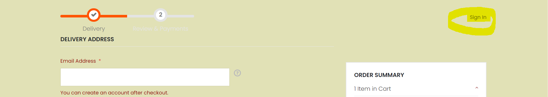
The first time I was going through the check-out on Magento 2.4, it took me a long time before I spotted the ‘Sign In’ link during the check-out process. I thought it was just us (problems with styles/formatting whatever) but I recently seen someone else’s screenshot and theirs was the same! It seems not logical to have one of the most important buttons/links hidden too far to the right and to be this small. I’m sure if I originally missed it, customers will too!
What would be a good solution to bring this to the forefront of customer’s attention and how to implement it? (make it bigger, move it more towards the center etc.)