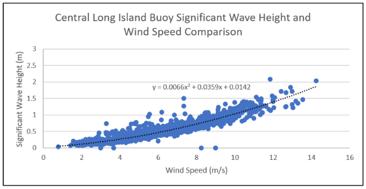
I have a scatterplot with a trendline function that is supposed to closely resemble the plot points. I am interested in seeing if there exists a correlation between the series of point values and the trendline by conducting a goodness of fit. To do this, I need to compare the “expected” values from the trendline with the “actual” values from the data points. Is there an efficient way of finding the goodness of fit and chi square value of these sets of data? Or would I have to manually extract the expected values from the trendline and mathematically compute the goodness of fit.
Here is an example of the graph for reference.