My original theme screen is like this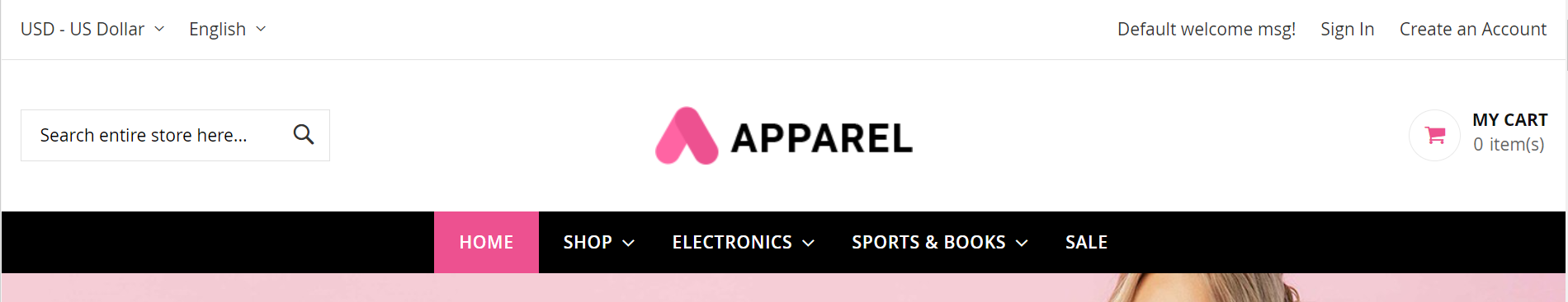
But I want in this way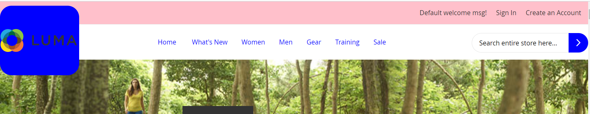
But due to these changes, my responsive view gets distorted like this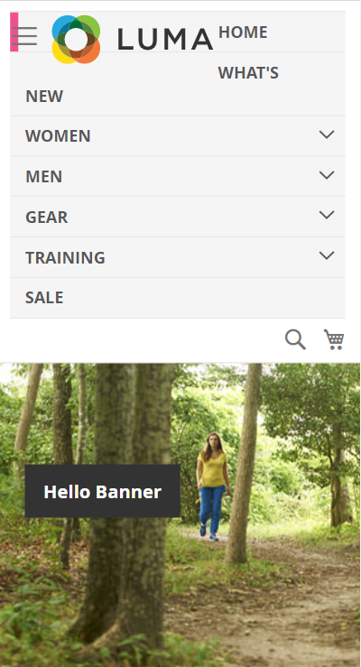 .
.
I wrote this line of code in the default.xml file <move element="catalog.topnav" destination="header-wrapper" after="logo" />
Any help would be appreciated. Thanks
![Routing between 2 Networks [Gateway is on a different Network]](https://www.rubin.com.np/wp-content/themes/customizr/assets/front/img/thumb-standard-empty.png)