I have some table with 2 columns of data. First one is project id, other is Time To Market in days (finish date minus start date). Smth like:
| Id | TTM |
|---|---|
| ID-1 | 23 |
| ID-2 | 11 |
| ID-3 | 167 |
| ID-4 | 2 |
| ID-5 | 40 |
I’m trying to make Pareto chart. I have selected this data (two ranges) and create a diagram with type “Pareto”. Excel automatically found the correct columns for X and Y Axis, but used not appropriate intervals for X Axis. I have set interval equal to 15 and then it’s almost fine… Almost. I do not know why, but it’s ordered the columns on X Axis in the wrong order. It’s moved zero values to the end instead of correct order for numbers.
E.g. it’s rendering char with intervals: … (75, 90], (150, 65], (165, 180], (90, 105], (105, 120], etc.
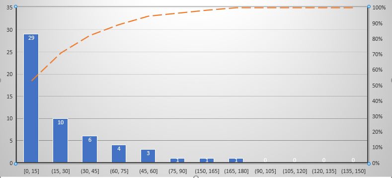
I have tried to sort the data or find some settings but not succeeded.
I want to get X Axis in the next order: … (75, 90], (90, 105], (105, 120], …, (150, 65], (165, 180]. How can i do that?

